About Me
Excel VB Programming (VB6)
Excel Spreadsheet Formulas
Excel VB.NET Programming
Access Programming (2003)
Material Management
![]() Six Sigma Methods &
Tools
Six Sigma Methods &
Tools
Lean Six Sigma Methods and Tools Used
Below are the sets of tools being utilized in Six Sigma methodologies.|
Brainstorming Tools
Process Mapping Tools
Root-Cause Analysis Tools
Risk Analysis Tools |
Data Gathering Tools
Process Planning Tools
Advanced Analytical Tools
|
Strategic Planning Tools
Statistical Analysis Tools |
Process Control Tools
Other Tools & Techniques |

In statistical terms, the purpose of Six Sigma is to reduce process variation so that virtually all the products or services meet or exceed customer expectations. This is defined as being only 3.4 defects per one million opportunities (DPMO).
 |
|||||
| Process Sigma | DPMO | Long Term Yield % (i.e. percentage of successful outputs | |||
| 1 | 691,462 | 30.9 | |||
| 2 | 308,538 | 69.1 | |||
| 3 | 66,807 | 93.3 | |||
| 4 | 6,210 | 99.4 | |||
| 5 | 233 | 99.98 | |||
| 6 | 3.4 | 99.99966 | |||
| Figure 1.1 One to Six Sigma areas under Normal Curve |
Table 1.1 One to Six Sigma conversion table |
||||
How to calculate DPMO, Defects Percentage and Process Yield?
DPMO = (total no. defects / total no. of process opportunities) x
1,000,000
Defects Percentage = (total no. defects /
total no. of process opportunities) x 100
Process Yield = (100 - defects Percentage)%
Assuming there are 220 defects per million and a shift of 1.5 for all values of z. In Excel, you type as:
NORMSINV [1 - (220/1,000,000)] + 1.5 = 5 sigma or 5.02
Six Sigma was developed by Motorola in 1980s, but today Six Sigma comprises lots of things and has many meanings over time. In different terms, Six Sigma is:
-
a metric, a business development methodology, a management system, and all three at the same time.
-
a data-driven and statistical analysis method that can measure and improve any element of production activities and customers services, with a focus on customer impact.
-
a process that structures work into Project Charters that clearly define the project goals and potential benefits which are directly link to strategic critical success factors, customer value and bottom line results.
At the heart of the Six Sigma are two methodologies - the DMAIC model for problem solving and process improvement, and the DMADV model for creating new product designs or process designs in such a way that it results in a more predictable and defect-free performance.
DMAIC stands for:
-
Define the problem, customer requirements, business goals and objectives, team roles and responsibilities, scope and resources, processes, and performance baselines.
-
Measure the problem or processes (variations, defects per unit, defects per million opportunities, and the yield percentage).
-
Analyze the root causes of the problem or process.
-
Improve the process by implementing counter-measures.
-
Control the performance by putting in place control mechanism to monitor and sustain new level of improvement.
DMADV stands for:
-
Define the goals of the design activity that are consistent with customer demands and enterprise strategy.
-
Define the goals of the design activity that are consistent with customer demands and enterprise strategy.
-
Measure and identify CTQs (critical to qualities), product capabilities, production process capability, and risk assessments.
-
Analyze the design alternatives, develop high-level design and evaluate design capability to select the best design.
-
Design details, optimize the design, and plan for design verification. This phase may require simulations.
-
Verify the design, set up pilot runs, implement production process and handover to process owners.
At its core, Six Sigma revolves around a few key concepts as follow:
-
Critical to Quality: Attributes most important to the customer.
-
Defect: Failing to deliver what the customer wants.
-
Process Capability: What your process can deliver.
-
Variation: What the customer sees and feels.
-
Stable Operations: Ensuring consistent, predictable processes to improve what customer sees and feels.
-
Design for Six Sigma: Designing to meet customer needs and process capability.
Lean Six Sigma
Lean Six Sigma for services is a business improvement methodology that maximizes shareholder value by achieving the fastest rate of improvement in customer satisfaction, cost, quality, process speed, and invested capital. But how actually does Six Sigma and Lean complement one another?
For Six Sigma, it:
-
Emphasizes the need to recognize opportunities and eliminate defects as defined by customers.
-
Recognizes that variation hinders our ability to reliably deliver high quality services.
-
Requires data driven decisions and incorporates a comprehensive set of quality and analytical tools under a powerful framework for effective problem solving.
-
Promises and delivers over $500,000 of improved operating profit per Black Belt per year, when implemented correctly (a target many companies consistently achieved).
For Lean, it:
-
Focuses on maximizing process velocity.
-
Provides tools for analyzing process flow and delay times at each activity in a process.
-
Emphasizes on the separation of "value-added" from "non-value-added" work or 'wastes' with tools to eliminate the root causes of non-valued activities and their cost, for example, the 7 Wastes.
The key concepts of a Lean Enterprise center on 5 principles:
-
Value: A product and/or service defined by the Customer.
-
Value Stream: All actions to bring a product and/or service to the customer.
-
Flow: How the value stream actions work together.
-
Pull: Provide value when the customer asks for it.
-
Perfection: Focus on the customer and eliminate waste.
The fusion of Lean and Six Sigma improvement methods is required because:
-
Lean alone cannot bring a process under statistical control.
-
Six Sigma alone cannot dramatically improve process speed or reduce invested capital.
-
Both enable the reduction of the cost of complexity.
The two methodologies interact and reinforce one another, such that percentage gains in Return on Investment (ROI) are much faster if Lean and Six Sigma are implemented together. In short, what sets Lean Six Sigma apart from its individual components is the recognition that you cannot do "just product/service quality" or "just process velocity," but you need a balanced process that can help an organization focus on improving service quality, as defined by the customer within a set time limit.
Six Sigma identifies five key roles for its successful implementation.
-
Executive Leadership includes CEO and other key top management team members. They are responsible for setting up a vision for Six Sigma implementation. They also empower the other role holders with the freedom and resources to explore new ideas for breakthrough improvements.
-
Champions are responsible for the Six Sigma implementation across the organization in an integrated manner. The Executive Leadership draws them from the upper management. Champions act as mentor to Black Belts.
-
Master Black Belts, identified by champions, act as in-house expert coach for the organization on Six Sigma. They devote 100% of their time to Six Sigma. They assist champions and guide Black Belts and Green Belts. Apart from the usual rigor of statistics, their time is spent on ensuring integrated deployment of Six Sigma across various functions and departments.
-
Experts work across company boundaries, improving services, processes, and products for their suppliers, and for their customers. Experts work not only across multiple sites, but can be also across business divisions, incorporating lessons learned throughout the company.
-
Black Belts operate under Master Black Belts to apply Six Sigma methodology to specific projects. They devote 100% of their time to Six Sigma. They primarily focus on Six Sigma project execution, whereas Champions and Master Black Belts focus on identifying projects/functions for Six Sigma.
-
Green Belts are the employees who take up Six Sigma implementation along with their other job responsibilities. They operate under the guidance of Black Belts and support them in achieving the overall results.
You can find from the history of Six Sigma that many organizations, service industry and government departments, had used the model to leverage huge performance improvements and billions dollars in cost savings. None of them happens on its own but require trained teams and team leaders to cohesively implement Six Sigma processes - especially the use of the measurement and improvement tools, and in communication skills, necessary to serve the needs of internal and external customers and suppliers that form the critical processes of the organization's values stream. Success or failure of a project also depends on the careful selection and application of right tools. From next section onwards, I will focus solely on the tools that are used in the Six Sigma model.
Activity Network
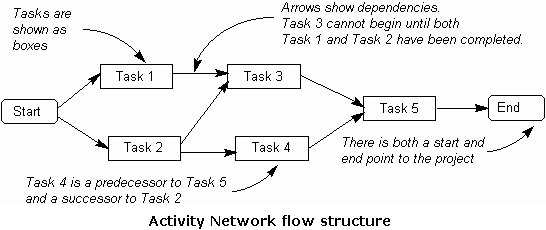
It is one of the QFD's 7 core tools, used in project planning for connecting together a multi-task complex set of interdependent activities. The Activity Network is sometimes called an Arrow Diagram or PERT Chart, where PERT stands for Programmed Evaluation Review Technique. It allows you to calculate what task to start when, the earliest start date and find quicker ways to work around dates, what float there in the project, and to address risks to completing a project on time. We usually use Project Management software programs to work with Activity Networks. The programs perform the critical path calculation, along with other tasks such as leveling and cost calculations.
See this flow-structure of an Activity Network diagram. A project is composed of a set of actions or tasks which usually have some kind of complex interdependency, and Activity Network flow diagram explain such interconnections much better through words. The diagram explains about predecessor tasks and successor tasks, and the points where arrows meet are called nodes. Because there are tasks/activities at these points, it is also known as an Activity-on-Node Diagram. It is usually easier to work with than the alternative Activity-on-Arrow Diagram, where the arrows represent tasks, where we use Critical Path Method (or CPM) to calculate the time required to complete each task. Once the start date for the overall project is known, CPM can provide the earliest and latest start dates for each task.
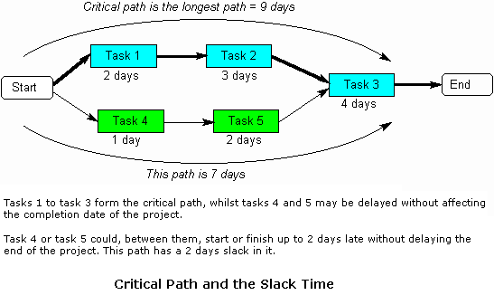
The amount of time that a task can be delayed without affecting the completion time of the overall project is known as the Slack Time or Float. Slack can either be regarded as a 'safety margin'. The total of all slack times for all tasks in the project gives the total 'time wasted', and may be reduced if the tasks can be rearranged. When people and resources are allocated to tasks, it may also be necessary to rearrange tasks so that people do not have to work overtime to work on more than one task at once. This is called 'leveling' or 'resource smoothing'. The critical path through the activity network is the sequence of tasks which have zero slack time. Thus, if any task on the critical path finishes late, then the whole project will also finish late. See this second diagram that explains Critical Path and Slack Time.
There could be situation of a task or activity which takes no time to complete. This is called a 'checkpoint' or 'milestone', and is usually included in the diagram to highlight an important point in the project. The Activity Network can be used to identify risk in the plan.
Below are typical areas where risk of the schedule being slipped are imminent. [ Click ] to see this diagram.
-
Anywhere on the critical path.
-
Where a task has many predecessors, and if any one predecessor task is delayed, then the task will also be delayed.
-
Where there is a long sequence of tasks, each with a single predecessor and successor. If any task is delayed, it will delay all of its successor tasks. Also, a small risk of delay for each task adds up to a large delay for the overall task sequence.
-
When a resource or person that may become unavailable is used in any of the above situations, the risk is compounded.
-
Where there are several risky tasks running at one time, there are danger of a simultaneous failure.
Below are steps that show how to construct an Activity Network.
-
First Define the key objective of the plan.
-
Identify constraints (time, cost, etc) which may affect the actual tasks.
-
Identify the actual tasks that need to be done. (you can start with a Tree Diagram, but only the bottom-level tasks will be used in the Activity Network).
-
For each task identified, determine the time that each task will take, and write out their earliest start and finish dates, and their latest start and finish dates.
-
Identify the tools, resources, etc required for each task, including the person's name if is already known.
-
Start from the beginning, write out which tasks must be done first, second... until all the last tasks.
-
Arrange the sequence of start of the tasks into a spreadsheet, starting from the first left column.
-
Draw out the task boxes in their start sequence and connect them by arrowed lines.
-
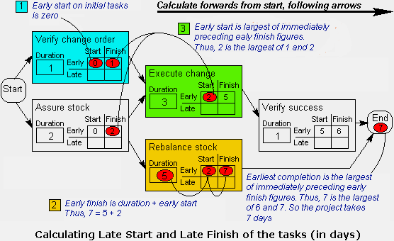
Starting with the tasks at the beginning of the diagram, write the early start and early finish for each task in turn, following the arrows to the next task. [ Click ] to see the explanation in this diagram.
(Note: the early start of a task is the same as the early finish of the preceding task. If there is more than one predecessor task, then there are several possible early start figures; select the largest of these. The early finish for each task is simply the early start plus the duration of the task).
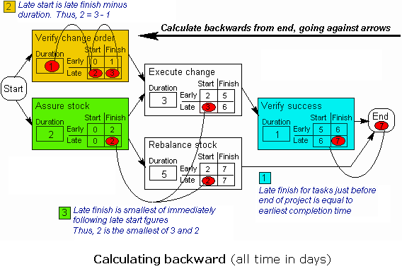
Starting with the tasks at the end of the diagram, complete the late start and late finish for each task in turn, following the arrows in the reverse direction to the previous task. [ Click ] in this diagram to see the explanation on calculating backward.
(Note: a task cannot be completed until all of its successors have been completed. The late finish is the same as the late start of the succeeding task. For the final tasks in the project, this is equal to the earliest completion date, calculated in step 9. If there is more than one successor task, then there are several possible late figures; select the smallest of these. The late start for each task is simply the late finish minus the duration of the task).
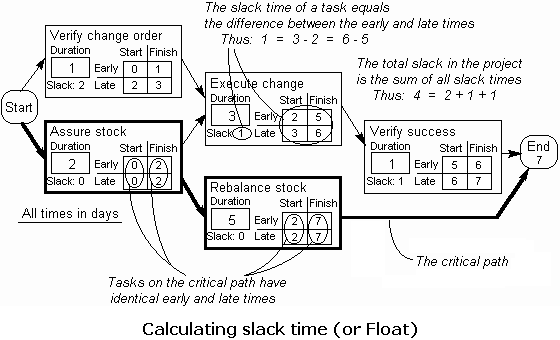
Calculate the slack time for each task as the difference between the early and late times. Also identify the route through the diagram where the slack time on each task through the route is zero. This is called the critical path, as any slippage in these tasks will affect the overall project completion date. [ Click ] in this diagram to see how float is calculated.
Check that the plan meet all the constraints you had identified, and and act upon the results. Your actions may include:
-
Reducing the total slack in the project by rearranging tasks.
-
Preventing people from having to work overtime, reallocation and task rearrangement.
-
Identifying risky parts of the plan and reducing risks by reallocation or rearrangement.
-
Recalculating the early and late times to find the effect of the above actions on the critical path, the project completion time and the slack.
Begin tasks, use the activity diagram to help manage your project. Management actions may include:
-
Substituting actual durations of tasks into the diagram.
-
Re-estimating future task durations, using known task durations.
-
Adding, modifying or removing tasks.
-
Rearranging the resources used.
-
Recalculating the early and late Start and Finish times to find the effect of the above actions.
Affinity Diagram
Affinity Diagram (sometimes referred to as a "KJ", after the initials of the person who created this technique, Jiro Kawakita) is a brainstorming tool that is used to gather large amounts of ideas, opinions, or issues and group those items that are naturally related, and identify, for each grouping, a single concept that ties the group together.
An Affinity Diagram is especially useful in situations when:
-
The team is drowning in a large volume of ideas
-
New pattern of thinking is required
-
Broad issues or themes must be identified
-
Building an Affinity Diagram is a creative rather than a logical process that encourages participation and to draw everyone's ideas into the exercise.
For a given project in the view of project management there are essentially five phases:
-
Develop header and ideas
-
Display the ideas
-
Re-group headers and ideas
-
Create header cards
-
Build the Affinity Diagram
A header is an idea, a Phrase or sentence that captures the essential link among the ideas contained in a group of cards. Attached is an example of a 5 steps Affinity Diagram.
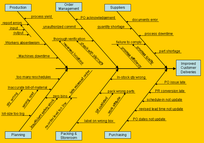
Cause and Effects Analysis
The cause and effect diagram (or sometimes called Ishikawa or fishbone diagram) illustrates the main causes and sub-causes (fishbones) that are believed to lead to the effect (head of the fish) being studied. The fishbone diagram identifies many possible causes for an effect or problem. It can be used to structure a brainstorming session. Using this process, it immediately sorts ideas into useful categories. The main categories are often selected as Methods, Equipment, Personnel, Materials, but other categories may be selected as appropriate (suppliers, operations, sales, customers, etc). It is important to identify the main causes or MPC (most probable causes) of the problem which can save the project team a lot of time.
5-why’s
The 5 Whys is a simple problem-solving technique that helps users to get to the root of the problem quickly. Made popular in the 1970s by the Toyota Production System, the 5 Whys strategy involves looking at any problem and asking: "Why?" and "What caused this problem?" Very often, the answer to the first "why" will prompt another "why" and the answer to the second "why" uncover another "why" and so on; hence the name the 5 Whys strategy. By asking the question "Why" we can separate the symptoms from the causes of a problem. This is critical as symptoms often mask the causes of problems. To visually view the process of the “5-why’s”, a fishbone diagram is often helpful. A good rule is that there is not typically one root cause for a problem, but potentially several. 5 Whys plays a part in the Deming Plan Do Check Act (PDCA) cycle and Isikawa root-cause analysis as well.
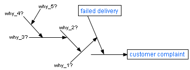
Following is an example of the 5 Whys analysis as a problem-solving technique:
1. Why did the robot stop? Because the circuit has overloaded, causing a fuse to blow.
2. Why is the circuit overloaded? Because there was insufficient lubrication on the bearings, so they locked up. 3. Why was there insufficient lubrication on the bearings? Because oil pump wasn't circulating sufficient oil.
4. Why is the pump not circulating sufficient oil? Because the pump intake is clogged with metal shavings.
5. Why is the intake clogged with metal shavings? Because there is no filter on the pump.
6. Why is there no filter on the pump? Because it is a revised design of the pump.
7. Why were there metal shavings in the pump? Because the modified design failed to capture them.
8. Why do they need to modify the design? Because it was our cost reduction program request.
9. Why did we have a cost reduction program on a critical robot function? Because........
The Whys continue on. As you can see, the 5 Whys can help you uncover root causes quickly. One common problem often happened in using 5 Whys is that people falling back on guesswork. Making a single mistake in any question or answer can produce false or misleading results.
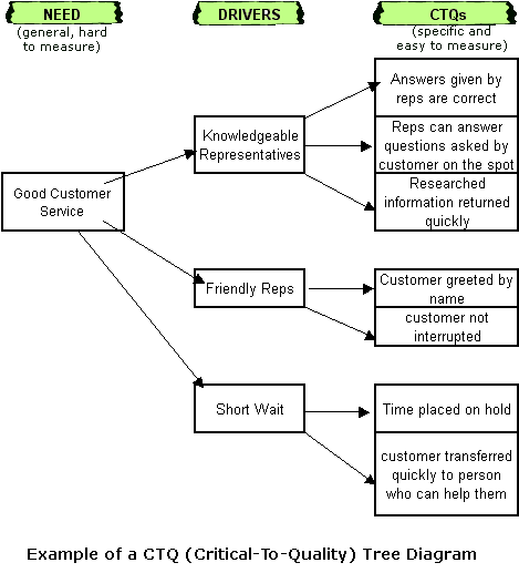
CTQ Tree
A CTQ tree (Critical-To-Quality tree) is used to decompose broad customer requirements into more easily quantified requirements. It sets out the measurable elements of a process that are critical to achieving customer quality and satisfaction. In one way, it also helps the project team to move from high-level requirement to detail specifications while ensuring that all aspects of customer's need are identified and fully aligned.
The CTQ measures are designed to ensure that company's process improvement and innovation projects are fully aligned with those areas that are most valued by customers. The upper and lower specification limits must be set on each CTQ measure to ensure that the product or process conforms to the standards required by the customers. A CTQ tree usually must be interpreted from a qualitative customer statement to an actionable, quantitative business specification. This process involves identifying the VOC and then establishing CTQ measures. You can expand the CTQ measures to level 3, 4 or more as required.
Here is an example of a 2-levels CTQ-Tree Diagram.
Day-In-The-Life Analysis
A Day-In-The-Life study is used to analyze the current jobs for non-value-added activities, and describe the future activities of a job when planned changes have been implemented. To develop a study on a person's job or duties, use the following steps.
-
Identify the job and role to be reviewed.
-
Confirm the job description and the purpose of the role.
-
List the key performance objectives for the role.
-
List the timing and activities performed on a regular day basis.
-
Assess how much each activity contribute towards the objectives at the end of day.
-
Make comments where there are concerns.
-
Asses the overall status for each activity by assigning symbol signs.
-
Summarize the % of time in each category (by symbol signs).
As people often resist any analysis of how they spend their time daily and productively, you should therefore insist to focus on the non-value added activities that you want to eliminate but which they try to avoid.
[ Click ] See an employee example of a Day-In-The-Life study.
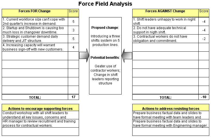
Force Field Analysis
Force Field Analysis is a qualitative analytical tool that is designed to show the positive and negative forces impacting a change within an organization. The positive or driving forces (forces that favor change) are represented as pushing against the negative or restraining forces (forces that impede change). In effect, it is a specialized method of weighing pros and cons. By carrying out the analysis you can plan to strengthen the forces supporting a decision, and reduce the impact of opposition to it.
You can easily create a template in the spreadsheet like the one I have shown below. First, describe your plan or proposal for change in the middle column. Then list all the forces for change on the left column, and all the forces against the change on the right column. Finally assign a score to each force, from -5 (weakeast) to 5 (strongest). Once you have carried out an analysis, you can decide whether your project is viable. If you have already decided to carry out a project, Force Field Analysis can help you to work out how to improve its probability of success. There are two ways - to reduce the strength of the forces opposing a project, or to increase the forces pushing a project. Often the most elegant solution is the first choice as just trying to force change through may cause its own problems.
Failure Modes and Effects Analysis (FMEA)
FMEA is also sometimes used interchangeably with Failure Modes, Effects
and Criticality Analysis (FMECA). FMEA uses a step-by-step approach to
risk mitigation, possible failures analytic, and defects prevention in
both product design and implementation processes, manufacturing
processes or services. Failures are prioritized according to how serious
their consequences are, how frequently they occur and how easily they
can be detected. The purpose of the FMEA is to identify potential
problems or failure modes, and take actions to prevent, eliminate or
reduce failures, starting with the highest-priority ones.
Failure modes and effects analysis also documents current knowledge and actions done about the risks of failures, for use in continuous improvement. Ideally, FMEA should begin during the earliest conceptual stages of design and continues throughout the product or service life cycle.
The precursor to a FMEA is a Process Map which describes the steps of a process along with the inputs & outputs for each step. FMEA is done in a spreadsheet with a column for each piece of data, and preset calculations for the necessary math functions.
When do you use FMEA? You use it under these circumstances:
-
To initially design any system, product, or process.
-
To subsequently change the system, product, or process.
-
To detect potential failure modes and define risks.
-
To prioritize attention to key process input variables that have the most probable impact on the desired and undesired outcomes.
-
To assess the effectiveness of attempts to control variability.
Below are FMEA procedural steps. (actual specific details may vary with standards of your organization)
-
Identify the different Failure Mode for each step within the process.
-
Identify the Effects of that Failure Mode being realized. If more than 1 effect could result, list each effect on a separate line duplicating all the data to the left.
-
Use a scale from 1 (lowest) to 10 (highest), to rate the overall Severity of the Failure Effects on the process.
-
Identify Potential Causes for the Failure mode. If multiple causes exist for the Failure Mode, likewise, list each cause on a separate line duplicating all the data to the left.
-
Use a scale from 0 (most unlikely) to 10 (most likely), to rate the Likelihood of Occurrence that the Cause will actually happen.
-
Identify any Controls which are in place to detect or control the causes which drive the Failure Modes. A control is any function which would raise awareness of the presence or increased potential of the cause, or detect (after the fact) that the cause has already occurred.
-
Use a scale from 0 (most likely to discover) to 10 (most unlikely to discover), to rate the Detectability of the cause happening before any negative effects occur. If no detection methods are in place, the Detectability should be scored a 10.
-
Calculate the Risk Priority Number (RPN) of the Failure Mode-Cause-Likelihood-Detectability combination by multiplying the 3 numeric scores together. The result will range from 0 to 1000. The larger the number, the higher the risk that particular combination poses to the overall process. As a rule of thumb, risks with an RPN greater than 400 are generally considered significant.
-
After the RPNs are identified, you assign specific actions to address the impact, likelihood or detectability of the risk. Once these actions are assigned, the impact on the risk can be determined by recalculating the Impact, Likelihood and Detectability scores after the actions are taken. This gives the Potential RPN. The impact of the actions is then the RPN minus the Potential RPN.
[ Click ] See this example of a FMEA. Download spreadsheet.
FMECA (Failure Mode and Effects Criticality Analysis)
Besides FMEA, this is another modified systematic analytic approach called FMECA, which is being employed for identification and critical analysis of potential failure modes in a system design/development and production environment primarily caused owing to deficiencies in processes.
Primary goal of the FMECA is to focus on very high risk defect prone areas in product design which are supposed to escape detection even in the inspection phase. Using FMECA a criticality analysis process is applied iteratively in order to eliminate probable and very severe failure modes. A typical priority ranking scheme RPN (Risk Priority Number) is also used where results are generally analyzed based on a scale from 0 to 10. The RPN is a product of detectability, frequency of occurrences and degree of severity.
The higher the RPN, the more the process becomes a candidate for FMECA. The highest RPN is 10x10x10 = 1000 which means that the failure is not detectable by inspection, a very severe case and the occurrence is almost sure sure.
Process Flowchart
Also called process flow diagram (PFD) or process map, it is a visual analytical tool that is designed to enable project teams to map and analyze processes at different level of detail. The process flowchart allows key steps to be mapped out to increase the project teams understanding of key flows and of the 6 key factors - inventory, costs, revenues, working capital, time and quality measures. Process mapping should also focus on areas such as the number of steps, number of physical handovers and value of activities.
Process Flowcharting can easily be created using Excel, PowerPoint and Visio. For information system, there are also many software that are available today that can convert source code algorithms into process flow diagram. Here is an example of a through-hole PCB assembly that goes through the wave-soldering process flowchart. Another example of a cross-functional process map. Also, a computer program algorithm flowchart.

Interrelationship Diagram
In many problem situations, there are multiple complex relationships between the different elements of the problem, which cannot be organized into familiar structures such as hierarchies or matrices. The Interrelationship Diagram (or sometimes called Cause-Effect Relations Diagram) can be used to show any complex relationship between the different problem elements and their causes, such as information flow within a process. The technique addresses these situations by showing relationships between items with a network of boxes and arrows. The Interrelationship Diagram can contain one or more effects and multiple causes, with arrows pointing from cause to effect. The network of arrows is built up as multiple causes interrelate as demonstrated in this example [ Click ].
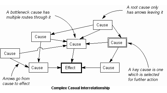
A good Cause-Effect Interrelationship Diagram will always show a balance of causes and relationships that describes the problem clearly and completely, without being vague. There are some useful points when constructing a Cause-Effect Relations Diagram:
-
Arrows flowing only away from a cause indicate a root cause. Eliminating root causes can result in subsequent causes also being eliminated, giving a significant improvement for a relatively small effort.
-
A cause with multiple arrows flowing into it indicates a bottleneck. This can be difficult to eliminate, due to the multiple contributory causes.
-
A key cause is one which is selected to be addressed by future action.
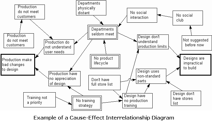
Here is one story between the production dept and the design dept of an industrial cabinets company. The design dept complains that production often modify their designs, whereas production complains that their designs often are impractical to build. So finally two members from each department met and use cause-effect relationship diagram to try to find key causes of the problem and how they could solve it. They list down their problems and all the possible causes, and then gradually able to link up all the causes to the problems by connecting the arrows on the diagram blocks. Eventually they are able to identify and agree on the final key causes. This is how their cause-effect interrelationship diagram looks like. As result, a cross-functional task force developed a product lifecycle to involve all departments. This included cross-functional meetings and training requirements.
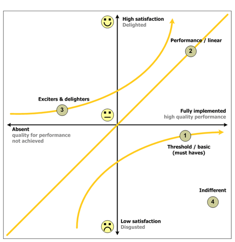
Kano Model Analysis
The Kano Model of Customer Satisfaction classifies product attributes based on how they are perceived by customers and their effect on customer satisfaction. The classification of essential and differentiating attributes are useful for guiding design decisions in that they indicate when good is good enough, when more is better, and when more doesn't make a significant difference.
Product characteristics can be classified as:
-
Threshold (or Basic) attributes - these are the expected attributes or “musts” of a product, and do not provide an opportunity for product differentiation. Increasing the performance of these attributes provides diminishing returns in terms of customer satisfaction, however the absence or poor performance of these attributes results in extreme customer dissatisfaction. An example is brakes on a car.
-
One-dimensional (or Performance) attributes - these characteristics are directly correlated to customer satisfaction. Increased functionality or quality of execution will result in increased customer satisfaction. Conversely, decreased functionality results in greater dissatisfaction. An example is Product price.
-
Excitment (or Exciters/Delighters) attributes - Customers receive great satisfaction from a feature and are willing to pay a price premium. However, the absence of the product's feature does not lead to customers dissatisfaction. In a competitive marketplace where manufacturers’ products provide similar performance, providing excitement attributes that address such “unknown needs” can provide a competitive advantage. These features are often unspoken and unexpected by customers, and can be difficult to establish as needs during initial design. An example is a car's dual safety bags instead of a single.
-
Other Attributes - Products often have attributes that cannot be classified according to the Kano Model. These attributes are often of little or no consequence to the customer, and do not factor into consumer decisions.
The Kano Model is useful in these Project activities:
-
Identifying customer needs
-
Determining functional requirements
-
Concept development
-
Analyzing competitive products
See an example of the Kano Model.
Matrix Diagrams
Matrix Diagrams The Matrix Diagram is one of the 7 core tools used in Quality Function Deployment (QFD). Matrix Diagram allows a many-to-many comparison of two lists, by turning the second list on its side to form a matrix as shown in L-Matrix example below. The L-Matrix shows how the relationship between two items can now be indicated in the cell where the row and column of the two items cross.
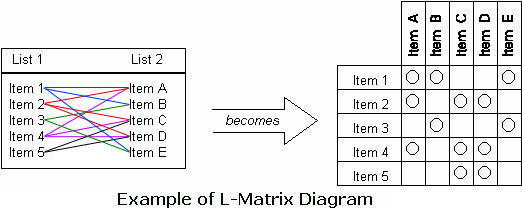
The Matrix Diagram can also show the relationship between 3 or 4 lists of information. It can also be different groups, tasks, roles, measurements, customer requirements versus your design specifications, etc. This tool is used to clarify problems through thinking multi-dimensionally. It consists of a two-dimensional array to determine location and nature of problem. Tree diagram needs to be constructed before moving to Matrix diagram. Common extensions to the Matrix Diagram include the use of different symbols to indicate different comparison levels and the weighting of the items being compared. There are a number of different shapes of matrix for comparing more than the basic two lists. Besides L-Matrix, it also includes C-Matrix, T-Matrix, X-Matrix, Y-Matrix and roof-shaped-Matrix.
-
L-shaped matrix relates two groups of items to each other (or one group to itself).
-
T-shaped matrix relates three groups of items: groups B and C are each related to A. Groups B and C are not related to each other.
-
Y-shaped matrix relates three groups of items. Each group is related to the other two in a circular fashion.
-
C-shaped matrix relates three groups of items all together simultaneously, in 3-D.
-
X-shaped matrix relates four groups of items. Each group is related to two others in a circular fashion.
-
Roof-shaped matrix relates one group of items to itself. It is usually used along with an L- or T-shaped matrix.
| L-Shaped | 2 Groups | A-->B (or A-->A) | |
| T-Shaped | 3 Groups | A-->C but not B-->C | |
| Y -Shaped | 3 Groups | A<-->B<-->C<-->A | |
| C-Shaped | 3 Groups | All three simultaneously (3-D) | |
| X-Shaped | 4 Groups | A<-->B<-->C<-->D<-->A but not A<-->C or B<-->D | |
| Roof-Shaped | 1 Groups | A<-->A when also A<-->B in L or T |
[ Click ] See this visual perspectives of the multidimensional matrices as shown in the above table.
Moments of Truth
Moments-of-Truth are points in the process, time or interaction when customer form a view about the quality of a product or service. Typically, a Moment of Truth is any opportunity that you can create a lasting perception in our customer’s mind where first impressions are often the critical moments. When customers have certain expectations and they are disappointed, then they can form very negative impressions. MOT analysis helps a project team to see clearly where the critical points of customer interaction take place in a process.
To apply the MOT methodology in your project, follow the following steps:
-
Identify the process to be reviewed and agree on its scope and boundaries.
-
List out all the major activities in the process.
-
Identify all critical points of customer interaction - moments of truth.
-
For each MOT, specify who internally is responsible.
-
Align and agree on target service level for each MOT.
-
Confirm and compare current service levels or product's performance, and targets.
-
Used, for example, red-yellow-green to identify current status of each MOT.
-
Identify improvement opportunities and next steps.
MOT analysis requires participants to have background information on the processes being analyzed such as customer process maps, complaints data, service levels specification, etc.
Pareto Analysis
Pareto analysis is an analysis/diagramming technique that uses frequency of occurrence to identify and display results generated by each identified cause. This analysis is commonly used to focus on efforts or the problems that have the greatest potential for improvement by showing relative frequency or size in a descending bar graph. It is based on Pareto principle - 20% of the sources cause 80% of any problems - and applies to many areas of process improvement.
See this example of Pareto analysis on the material classes.
Prioritization Matrix
Prioritization matrix is a technique used to narrow down options through a systematic approach of comparing choices by selecting, weighting, and applying criteria. It is also used to prioritize complex or unclear issues, where there are multiple criteria for deciding importance. When there is no objective data available and the people involved have a difference of opinion about which should be acted upon first from a list of issues, this is when you need a prioritization matrix.
You can use it with your team members or with your users to achieve consensus about an issue. The matrix helps you rank problems or issues (usually generated through brainstorming) by a particular criterion that is important to the organization. Then you can see more clearly which problem should be solved first. It increases the chance of follow-through because consensus is sought at each step in the process, from criteria to conclusions.
The Prioritization Matrix provides a way of sorting a diverse set of items into an order of importance. It also enables their relative importance to be identified by deriving a numerical value of the importance of each item. In order that the items can be compared with one another, each item is scored against each of a set of key criteria, and the scores for each item are then summed. For example, a potential solution of 'Use high grade materials' will get a high score on the criterion of, 'Low cost of maintenance', but will get low score on 'Low cost of materials'. Also, take note that a good criterion reflects key goals and enables objective measurements to be made. For example, 'material cost' is measurable and reflects a business profit goal, where as 'simplicity' may not reflect any goals and is difficult to score. Because some criteria are always more important than others, we can allocate weighting values to each criteria. See this prioritization matrix example. Here is a second example but using a set of predefined option scores instead of using different weight for each criteria.
Process Decision Program Chart (PDPC)
PDPC is used to identify potential problems and countermeasures in a plan. It is a tool for contingency planning, and helps to realize what could go wrong or potential problems associated with the implementation of projects or programs.
When exactly do we use the Process Decision Program Chart? You use PDPC when you are setting up link objectives, mapping out contingencies, planning projects or implement improvements, identifying potential risks to the project's successful completion, and especially when risks are non-obvious such as in unfamiliar situations or in complex plans, and when the consequences of a failure can be disastrous. When risks are identified, use it to help identify and select from a set of possible countermeasures. A good way of planning is to break down the main task into a hierarchy of elements, using a tree diagram. The PDPC simply extends this chart several levels down to identify risks and countermeasures for the bottom level tasks, as shown here in Figure 1.2.
PDPC also works well in a text hierarchy, where you can use any combination of indentation, numbering, font italics or text coloring to show the depth of each item.
The flexibility of PDPC can result in very different diagrams, with various levels of detail and different symbols and boxes used to indicate specific items. The key point is the identification of risk and how it might be handled. Two of the most common elements of risk are cost and time, for example where there is a risk in a busy schedule of key equipment being unavailable and consequent time loss and additional expense being incurred in hiring replacement machines. A possible resolution of this risk is to hire standby equipment, which may be selected if this cost is considered to be lower than the cost of missing a committed completion date. The following are three possible routes that may be taken for coping with identified risks. The chosen approach in each case may affect actions during the construction of the PDPC, as indicated here in Figure 1.3.
-
Risk Avoidance means not taking an action that will result in an identified risk. Typically this route involves finding alternative actions. In sensitive cases, where the consequences of the risk occurring are catastrophic and there is no acceptable alternative, risk avoidance could result in the whole plan being abandoned.
-
Risk Reduction means taking some action that will reduce, but not eliminate, the identified risk. It may involve additional actions, such as extra testing to reduce the risk of failure of the final product. Typically this results in a trade-off of additional cost against reduced risk.
-
Contingency Planning does not reduce the chance of the identified risk occurring. Instead, it involves making additional plans, so that if the risk does occur you will be prepared and able to control the situation with the minimum cost and disruption.
Now how do we begin? Follow the following steps:
-
Break down the task into a Tree Diagram.
-
For each bottom-level task, identify a list of possible problems that could occur.
-
Select one or a few of the risks identified in step 2 to put on the diagram, based on a combination of probability of the risk occurring and the potential impact, should the risk materialize.
-
For each risk selected in step 3, identify possible countermeasures that you could take to minimize the effect of the risk.
-
Select a practical subset of countermeasures identified in step 4 to put on the chart.
-
Continue building the chart as above, finding risks and countermeasures for each task.
Project Charter
Project Charter is a document which contains a description of the project, a problem statement, business case, improvement opportunity, goal statement, outline financials, risk summary, project scope, stakeholders and scope, resources and their authorization, target completion date for each phase. Typically the charter is developed by the Project Sponsor or Process Owner and then is officially approved by Leadership to launch the project. It is the expected performance contract between the project team and the management. SMART is a useful acronym for Stretching, Measurable, Achievable, Related to the customer and Time-targeted. Attached is an example of a Project Charter. Attached is an example of a Project Charter.
Quality Function Deployment (QFD)
Quality Function Deployment (QFD) is a method used to transform customer needs into design quality, and to deploy methods for achieving the design quality into subsystems and component parts, and ultimately to specific elements of the manufacturing process. The Model was developed by Yoji Akao in 1966. QFD's use is particularly important in Design for Six Sigma (DFSS) projects.
QFD is largely designed to help companies focus on characteristics of a new or existing product or service from the viewpoints of market segments, company, or technology-development needs. The technique incorporates use of graphs and matrices. QFD helps transform customer needs (voice of the customer) into engineering characteristics (and appropriate test methods) for a product or service, prioritizing each product or service characteristic while simultaneously setting development targets for product or service.
Creating the QFD matrix and going through QFD process take a lot of effort. There are critical questions to evaluate after going through the QFD matrix:
Is the company focusing energies in the high leverage areas?
Is the company's planned product a lot more competitive?
Which of the company's technologies or features will have the most impact?
The tools that are used in QFD are the 7 Management and Planning Tools:
Other techniques and tools based on QFD are House of Quality, Pugh Concept Selection, and Modular Function Deployment.
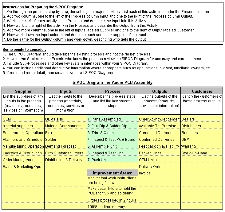
SIPOC Diagram
SIPOC - a qualitative process-mapping tool - stands for suppliers, inputs, process, output, and customers. You obtain inputs from suppliers, add value through your process, and provide an output that meets or exceeds your customer's requirements. SIPOC Diagram is created during the 'Define' phase. It helps to define the start and end points of a process, and to identify key process stakeholders and their scopes. Quality is judged based on the output of a process. The quality of the output is improved by analyzing input and process variables.
SIPOC requires project team participants to have detailed background information of the existing process maps, quality manuals, customer and supplier lists.
Below summarizes the key steps of a SIPOC methodology:
-
To ensure the right people are involved in the group analysis
-
Start with the process map - advisable to keep to no more than 5 high-level steps
-
Identify the process and boundaries
-
Identify the outputs of this process
-
Identify the customers that receive these outputs
-
Identify the inputs that this process require
-
Identify the suppliers of inputs to this process
-
Identify key areas where improvements are required
-
Agree on areas for further analysis and next steps.
Stakeholder Analysis
Stakeholder analysis is a technique used to identify and assess the key
people, or groups that may significantly influence your project either
positively or negatively and plan strategies to win them over. In
another way, it can also be used to identify the stakeholders that are
likely to be affected by the activities and outcomes of a project, and
to assess how those stakeholders are likely to be impacted by the
project. Typically you need to find out who can influence the project
and outcome, who has the expertise and information, who has the decision
authority, and who can provide budget and resources.
As for the ways to communicate with each stakeholder, you can invite
them to the team meetings, meet with them informally and regularly when
required, and send them copy of the project, meeting minutes and
reports.
You can use a scale of -5 to +5 (where -5 means strongly resistant to
your project and has to manage carefully, 0 indicates being neutral, and
+5 means strongly supportive and can be used to drive activities) to
classify the stakeholders by their power over your project and by their
interest in your project.
See this
example of Stakeholder analysis.
SWOT Analysis
SWOT analysis is a qualitative type of strategic-level analysis tool. SWOT stands for Strengths, Weaknesses, Opportunities and Threats. It is designed to assess a company's competitive environment. Strengths and weaknesses are internal to the organization, whereas opportunities and threats are relate to external factors. For this reason, SWOT Analysis is sometimes called Internal-External Analysis and the SWOT Matrix is sometimes called an IE Matrix Analysis Tool. The aim is for the project team to construct a 2 x 2 matrix including each of the four areas. I is recommended that each of the segment of the matrix should not exceed 10 bullet points.
TPM (Thought Process Map)
A Thought Process Map is a graphical depiction of a series of ideas thoughts or decisions. It is normally an initial collaborative process based on thoughts, ideas and queries of the entire project team in relation to process improvement strategy so as to encapsulate all the factors impacting the project. It typically depicts information in a structured visual format (tabular or bubble format), which can be referenced by the project team throughout the duration of the entire process. Here are two examples - bubble format [ Click ], business format [ Click ].
TPM provides a very effective way to brainstorm, take notes, gather and view information and even summarize data. It clearly identifies the assumptions the team has made, the actions that needs to be taken and pre-requisites if any. Its an extremely effective way of communicating, as well as consolidating all the information from a single person or among various teams lying in bits and pieces. A TPM is useful when as a team begins to form and enters the formation process - before scope may be established or a formal plan created. It also allows the team members to refer back to decisions made, when and why. A TPM is often used in conjunction with a Team Charter. TPM should be reviewed regularly and updated to reflect current activities.
TPM serves both a backward and forward looking perspective:
-
The TPM documents the major ideas and decisions that a team has considered and establishes the flow of thought or activity between them and establishes the relationships between them. While not a project schedule or detailed plan, the TPM addresses basic relationships as the sequence in which a given thought falls in the course of the effort.
-
The TPM lays out a broad course of action for a team of people into the future. However, "future" is here viewed in a very short term horizon of a few days or weeks or team meetings. It is not detailed like a project schedule, and is intended to collect multiple options for progress. In some cases, the TPM can serve to hold a variety of options for steps to be taken.
Below are some basic steps to create a Thought Process Map:
-
Define your project goals (from your Project Charter) near the top.
-
Identify all the List of the knowns and unknowns in your project.
-
Prioritize and sequence your don’t-know questions in the DMAIC stages.
-
Identify the leading questions you next need to answer.
-
Identify the Six Sigma methods and tools you need to answer those questions.
-
6. After you use the Six Sigma tools, briefly list out the results.
-
Repeat steps 3 through 6 as you progress on your project.
7 Wastes
The Chief Engineer for Toyota, Taiichi Ohno, is given credit for creating the Toyota Production System (TPS) and creating the 7-Wastes during the mid-1900. Waste is the use of resources over and above what is actually required to produce the product as defined by the customer. If the customer does not need it or will not pay for it, then it is waste, and this includes material, machines and labor. Toyota defines waste into 3 categories - Muri (Overburden), Mura (Inconsistency), and Muda (Elimination of waste). Muda further divides waste into 7 forms as being:
Others have included additional categories which include:
-
Untapped employee potential
-
Inappropriate systems
-
Energy and water
The 7-Wastes, though not really is a tool in itself, plays a valuable role in tackling inefficiency and therefore cost. It helps company to categorize problems and then focus attention in the appropriate areas once they have been identified.
5S
5S is a Lean Manufacturing housekeeping methodology, developed as part of Toyota Production System (TPS). 5S is a reference for standardized cleanup, order, or tidyness. The 5S supports other Lean ideas such as SMED (Single-Minute-Exchange-of-Dies), Total Productive Maintenance (TPM), and to some small measure Just-in-Time (JIT). 5S is also a foundation for Safety in the workplace, and is defined as:
Seiri: Sort, Tidiness.
It refers to the practice of sorting through all the tools, materials, etc., in the work area and keeping only essential items. Everything else is stored or discarded. This leads to fewer hazards and less clutter to interfere with productive work.
Seiton: Straighten, Orderliness.
This focuses on the need for an orderly workplace. Tools, equipment, and materials must be systematically arranged for the easiest and most efficient access. There must be a place for everything, and everything must be in its place.
Seiso: Shine, Cleanliness.
It indicates the need to keep the workplace clean and neat. Cleaning in Japanese companies is a daily activity. At the end of each shift, the work area is cleaned up and everything is restored to its place.
Seiketsu: Standardize.
This allows for control and consistency. Basic housekeeping standards apply everywhere in a facility. Everyone knows exactly what his or her responsibilities are. Housekeeping duties are part of regular work routines.
Shitsuke: Sustaining discipline.
This refers to maintaining standards and keeping the facility in safe and efficient order day after day, year after year.
Gemba
Gemba, a Japanese word, means "real place", where the real action takes place. In business, Gemba is where the value-adding activities to satisfy the client are carried out. Kaizen activities can be carried out endlessly, but only Kaizen on Gemba - "the real place" - is likely to yield some efficient improvement. In Production environment, Gemba refers to workplace, work cells, or shop floor. The workplace is often not recognized as the means to generate revenue, rather far more emphasis is on such sectors as financial management, marketing, sales, and product development. When defining Kaizen action plan, we always say: go to Gemba first. Get a sense of the reality at Gemba, walk the Gemba, talk with Gemba people.
Kaizen
Kaizen in Japanese means improvement. It involves everyone from managers to workers, and using much common sense. The key aspect of Kaizen is that it encourages gradual small improvements daily, on basis of ongoing incremental change instead of radical changes. In other words, there is always room for improvement and continuously trying to make processes become better.
Kaizen activities can be conducted in several ways. First and most common is to change worker's operations to make the job more productive, less tiring, more efficient or safer. This stage involves reviewing the current work standards to check the current performance and than estimate how and how much performance can still be improved. To get the worker's buy-in as well as significant improvement, worker is invited to cooperate, to reengineer by himself and with help of team mates or a Kaizen support group. The second way is to improve equipment, like installing foolproof devices and/or changing the machine layout. Third way is to improve procedures. All these alternatives can be combined in a broad improvement plan.
Kaizen is controlled and no unauthorized person is allowed to change designs, layouts or work standards. All workers are encouraged to suggest improvement ideas through suggestion box. Suggestions will be discussed by Kaizen management committee. Suggestions likely to be turned into application are usually rewarded according to the improvement gain.
Kaizen concept, to some extent, also incorporates a panel of many other process improvement techniques - SMED, TPM, Zero defect, foolproof Poka-Yoke, JIT. Howver, Kaizen is not the same as TQM. TQM is quite technical, stressing all kinds of tools, techniques, charts and graphs, where as Kaizen is more philosophical and softer. One kaizen characteristic is a fixation on finding and rooting out mistakes and errors. Each problem is seen as an opportunity for an improvement .Kaizen focuses on improving processes instead of results. Similarly, kaizen aims to improve systems, not people. of course, improvement must still be based on quantitative evaluation of process performance.
Six Sigma and Kaizen have many common grounds as they both are based on the principle that every organization is composed of a series of business processes , which have to be changed occasionally to accomplish better quality and efficiency. The following are some basic Kaizen procedures 6 Sigma teams put into practice for identifying problem areas and looking for operational results.
Identifying Key Problem Areas:
During this procedure, Six Sigma team and their team members focus their strengths on recording the various features of the business process for making the identification process considerably faster and easier. After the various elements of the given process are recorded, it turns out to be very easy for the implementation team to identify problem areas and advise corrective measures to solve them. Mapping of the process is useful in recording the aspects of a complex business process that has many sub-processes or sub-parts.
Focusing On Key Processes:
There are instances where, due to limited time, it is impossible to
evaluate every business process. In times like these, 6 Sigma teams
employ value stream mapping for recognizing processes that offer maximum
value and the ones that offer minimum value. Value stream mapping is
very helpful whenever there is some improvement in quality that has to
be carried out in a diminutive time for making it easier for 6 Sigma
teams to focus their quality improvement programs only on maximum value
providing processes.
This procedure is usually used in organizations where the real number of low value processes is considerably larger than the high value processes. This procedure may not be necessary in organizations with fewer processes or in organizations with high value processes.
Every Kaizen procedure illustrated above can be independently or simultaneously used on the basis of the type of business process in question. Six Sigma teams can always put their innovative skills and experience to use in conjunction with the given procedures to easy identify and solve critical issues with regard to Six Sigma implementation projects.
Kanban
Kanban is a procedure for production control and material flow control that avoids any time-consuming requirements planning and implements requirements-oriented production control. With kanban, a material is produced or procured only when it is actually required. A specific quantity of the components required to produce a material are stored on-site in containers. Once a container is empty, this components is replenished in accordance with a predefined strategy (in-house production, external procurement, or stock transfer from storeroom or other warehouse). In the interval between the request for replenishment and the delivery of the refilled container, the other containers will do the work of the empty one.
The replenishment process is largely automatic in the kanban process, and it reduces the large amount of manual posting work that are required. The Kanban process also reduces stock levels, as only components that are actually required are being produced or transferred in. Not all the materials are pushed through the production shopfloor based on the overall master schedule, but rather, it is requested by one production level (consuming area) from the previous production level (source) as needed.
With kanban process, the components required for production are stored in central supply areas and specific work centers can take what they need from these supply areas. A kanban control cycle is implemented that defines a replenishment strategy for the material whether it is to be produced in-house, procured externally or using stock-transfer. The control cycle must also specifies the number of containers in circulation between the consuming areas and supply source, and the quantity per container.
Below are the three examples of the kanban replenishment strategies:
In-House production:
-
Manual kanban
-
Replenishment with run-schedule quantity
-
Replenishment with Production Order
External procurement:
-
Replenishment by Order
-
Replenishment by Schedule Agreement
-
Replenishment by JIT call
Stock Transfer
-
Replenishment with Reservation
-
Replenishment with Direct Transfer Posting
-
Replenishment by transport requirements of warehouse's WMS administered storage location
In kanban replenishment process, the components required to produce a material, sub-assembly or module are available on-site in containers, ready for withdrawal. if one one of these containers is empty, the source that is responsible for its replenishment has to be informed accordingly. In a kanban process used outside the ERP system, the workers from consuming locations (example: store, warehouse) sends a card to the work centers (source). The card contains information about which components are needed, in what quantities, and where it should be delivered to. The source will then produce or procure the components and refill the container.
If kanban processing is used with ERP system support, the number of containers and their quantities are fixed in advance. Once the last piece of component is withdrawn from a container, the status of that container will be changed from "Full" to "Empty". This status change is the kanban signal and can be set by scanning a barcode reader over the card that is attached to the container. Some ERP systems allow the display of the containers in a production area in the form of a kanban table and the workers can make the status change on the screen. This kanban signal then triggers the replenishment process, for example, creating a production order. The source then processes the production order and the finished components are transported back to the containers. The status of the container is then set to "Full" again (using barcode or kanban table), and the goods receipt posted.
Poka-Yoke
Poka-Yoke (or called mistake-proofing) refers to devices and techniques that help operators to avoid making mistakes in their work caused by choosing the wrong part, leaving out a part, installing a part backwards, etc. It involves the implementation of fail- safe ways methods that detect or prevent both human and machine error at or near the source. Poka-Yoke can be small jigs or even simple makeshift devices set up to avoid or detect errors. Some Poka-Yoke examples are.
-
Processed part cannot continue on conveyor unless a specific sensor has not been activated.
-
Jig system holds odd shaped parts.
-
Pin system makes reverse tool setting impossible.
Here is a list of all the possible shop floor errors:
-
Processing/operating errors
-
Missing parts/wrong parts/mixed parts
-
Specification/measurement errors
-
Symmetrical and asymmetrical errors
-
Errors in equipment maintenance/repairs
-
Errors in preparation of tools/jigs
-
Setup/Adjustments errors
-
Tooling and tooling changes
Poka-Yoke are often set up in Kaizen context; a problem comes up, analyzing finds out causes and Poka-Yoke will prevent it from happening again.
SMED (Single Minute Exchange of Die or setup time)
SMED is sometimes used interchangeably with “quick changeover”. The method was developed in Japan by Shigeo Shingo. SMED and quick changeover are the practice of reducing the time it takes to change a line or machine from running one product to the next. The need for SMED programs is more popular now than ever due to increased demand for product variability, reduced product life cycles and the need to significantly reduce inventories. The successful implementation of SMED and quick changeover provides the company many benefits:
-
Reduce downtime
-
Reduce the scrap andwaste created during startup
-
Reduce WIP and finished goods
-
Reduce lot size
-
Keep expensive equipment running
-
Improved equipment utilization and yield
-
Faster ROI of capital equipment
-
Increased profitability
Typically when the last run of a product has completed, the equipment is shut down, locked out, the line is cleaned, tooling is removed or adjusted, and new tooling installed to accommodate the next scheduled product. Adjustments are made, critical values are met (die temperature, accumulators filled, hoppers loaded, etc.) and eventually the startup process begins – running product while performing adjustments and bringing the quality and speed up to standard. This process takes time, time that can be reduced through SMED.
Effective SMED programs identify and separate the changeover process into key operations – External Setup involves operations that can be done while the machine is running and before the changeover process begins, Internal Setup are those that must take place when the equipment is stopped. Aside from that, there may also be non-essential operations. The following is a brief example of how to attack the SMED process:
-
Eliminate non-essential operations – Adjust only one side of guard rails instead of both, replace only necessary parts and make all others as universal as possible.
-
Perform External Set-up – Gather parts and tools, pre-heat dies, have the correct new product material at the line… there's nothing worse than completing a changeover only to find that a key product component is missing.
-
Simplify Internal Set-up – Use pins, cams, and jigs to reduce adjustments, replace nuts and bolts with hand knobs, levers, toggle clamps.. etc. remember that no matter how long the screw or bolt only the last turn tightens it.
Always measure time lost to changeover and any waste created in the startup process so that you can benchmark improvement programs. Ever watch how a Formula1 racing pit crew mastering SMED and quick changeover?
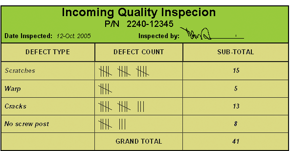
Check Sheet
It is a form easy to use in the collection of data, and in the observation of how often certain events happen. A check sheet can be constructed in whatever shape, size and format, as appropriate for the data collection. Generally, there are three types of check sheets used in collecting and recording data unique to a specific process.
-
Tabular Format. A tabular check sheet also known as a “tally sheet” is easy for you and your team to use when you simply want to count how often something happens or to record a measurement. Depending on the type of data required, the data collector simply makes a checkmark in a column to indicate the presence of a characteristic, or records a measurement, such as temperature in degrees centigrade, weight in pounds, diameter in inches, or time in seconds.
-
Location Format. A location check sheet allows you to mark a diagram showing the exact physical location of a defect or characteristic. An insurance adjuster’s pictorial claim form detailing your latest bumper bruise is an example of a location check sheet.
-
Graphic Format. Another way of collecting data is by using a graphic form of check sheet. It is specifically designed so that the data can be recorded and displayed at the same time. Using this check sheet format, you can record raw data by plotting them directly onto a graph-like chart.
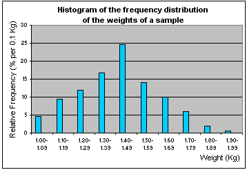
Histogram
Histogram is sometimes confused with a Bar chart, but they are different. Bar chart displays the frequency, distribution, and central tendency of a data set over a period of time. A histogram differs from a bar chart in that it is the area of the bar that denotes the value, not the height, a crucial distinction when the categories are not of uniform width.
A histogram displays the relative frequency or occurrence of data values-or which data values occur most and least frequently. Histogram illustrates the shape, centering, and spread of data distribution and indicates whether there are any outliers. The frequency of occurrence is displayed on the y-axis, where the height of each bar indicates the number of occurrences for that interval (or class) of data, such as 1 to 3 days, 4 to 6 days, and so on. Classes of data are displayed on the x-axis. The grouping of data into classes is the distinguishing feature of a histogram.
It is important to identify and control all sources of variation. Histograms allow you to visualize large quantities of data that would otherwise be difficult to interpret. They give you a way to quickly assess the distribution of your data and the variation that exists in your process. The shape of a histogram offers clues that can lead you to possible Xs. For example, when a histogram has two distinct peaks, or is bimodal, you would look for a cause for the difference in peaks.
Histograms can be used throughout an improvement project. In the Measure phase, you can use histograms to begin to understand the statistical nature of the problem. In the Analyze phase, histograms can help you identify potential Xs that should be investigated further. They can also help eliminate potential Xs. In the Improve phase, you can use histograms to characterize and confirm your solution. In the Control phase, histograms give you a visual reference to help track and maintain your improvements.
[ Click ] An example of a histogram.
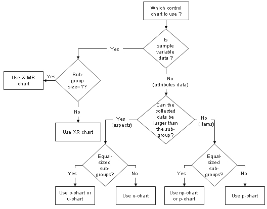
Which control chart should I use?
I include this section in view of many control charts that may be confusing as to which correct one to use. If the wrong control chart is selected, the control limits will not be correct for the data. The type of control chart required is determined by the type of data to be plotted and the format in which it is collected. Data collected is either in variables or attributes format, and the amount of data contained in each subgroup (or plotpoint) collected is specified.
Variables data is defined as a measurement such as height, weight, time, or length. Monetary values are also variables data. Generally, a measuring device such as a weighing scale, vernier, or clock produces this data. Another characteristic of variables data is that it can contain decimal places e.g. 3.4, 8.2.
Attributes data is defined as a count such as the number of employees, the number of errors, or the number of defective products. A standard is set, and then an assessment is made to establish if the standard has been met. The number of times the standard is either met or not is the count. Attributes data never contains decimal places when it is collected, it is always whole numbers, e.g. 2, 15.
Subgroup size is defined as the amount of data collected at one time. This is best explained through examples.
-
When assessing the temperature in a vat of liquid, the reading is measured once hourly; therefore the sample size is one per hour.
-
When measuring the height of parts, a sample of five parts is taken and measured every 15 minutes; therefore the sample size is five.
-
When checking the number of phone calls that ring more than three times before being answered, the sample size is the total number of phone calls received, which will vary.
-
When checking 10 invoices per day for errors, the sample size is 10.
Once the type of data and the sample size are known, the correct control chart can be selected. As a guideline, use the following charts-selection flowchart to select the most appropriate chart.
Eventually, everyone using SPC charts will have to decide whether they should change the control limits or leave them alone. The purpose of any control chart is to help you understand your process well enough to take the right action. This degree of understanding is only possible when the control limits appropriately reflect the expected behavior of the process. When the control limits no longer represent the expected behavior, you have lost your ability to take the right action. Merely recalculating the control limits, however, is no guarantee that the new limits will properly reflect the expected behavior of the process either.
You should ideally be able to answer yes to all of the questions below before recalculating control limits.
1. Have you seen the process change significantly, i.e., is there an assignable cause present?
2. Do you understand the cause for the change in the process?
3. Do you have reason to believe that the cause will remain in the process?
4. Have you observed the changed process long enough to determine if newly-calculated limits will appropriately reflect the behavior of the process?
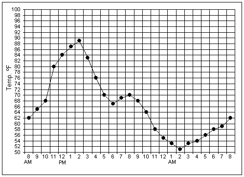
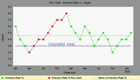
Run Charts
Run charts display process performance with consecutive data points over time. An average line is usually added to a run chart to monitor dispersion of the data away from the average. Upward and downward trends, cycles, and large aberrations may be spotted and investigated further. In a run chart, events shown on the y axis, are graphed against a time period on the x axis. Run charts can also be used to track improvements that have been put into place, checking to determine their success. Run Charts are similar to Control Charts, however there are some important differences. Control Charts are better for monitoring process performance on an ongoing basis. Run charts are often better for investigating short term process improvement opportunities. It is used in many phases of the DMAIC process.
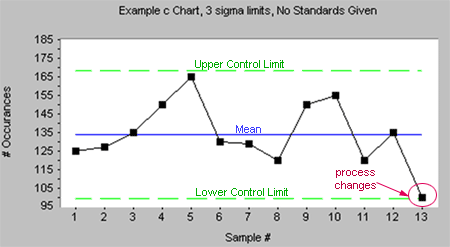
Control Charts
There are two main types of Control Charts, based upon the measurement types. For measurement of unit parts, these are called "indiscrete values" or "continuous data". Other types of data are based on counting, such as the number of defective articles or the number of defects. These are known as "discrete values" or "enumerated data".
Control charts all have a set of common elements: X-axis shows time periods, Y-axis shows the observed values, UCL and LCL line shows the upper and lower control limit, 95% or 99% of data should fall within UCL and LCL, and values outside the control limits mark statistically significant changes and may indicate a change in the underlying process.
Although every process varies, but they vary between predictable limits. It is important to monitor and notice the 'special causes' of variation in the processes as soon as they occur. For this purpose, control charts are used to monitor the output of a process. They are used to give timely warning of 'special causes' entering the process. They generally monitor either the process mean, the process variation or a combination of both.
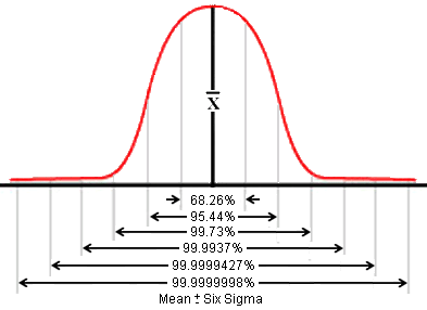
Upper and lower control limits, which define the area 3 standard deviations on either side of the centerline. Control limits reflect the expected range of variation for that process. Control charts determine whether a process is in control or out of control. A process is said to be in control when only common causes of variation are present. This is represented on the control chart by data points fluctuating randomly within the control limits. Data points outside the control limits and those displaying nonrandom patterns indicate special cause variation. When special cause variation is present, the process is said to be out of control. Control charts identify when special cause is acting on the process but do not identify what the special cause is. There are two categories of control charts, characterized by type of data you are working with: continuous data control charts and discrete data control charts.
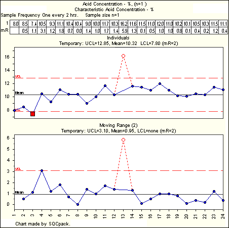
[ Click ] example of a Control Chart.
Scatter Plot
Scatter plot (or scatter diagrams) is a graphic tool that illustrates the relationship between two variables that both relate to the same "event". The variables may be a process output (Y) and a factor affecting it (X), two factors affecting a Y (two Xs), or two related process outputs (two Ys). Scatter plots are useful in determining whether trends exist between two or more sets of data. A straight line of best fit, using the least squares method, is often included. Scatter plots are used with continuous and discrete data and are especially useful in the Measure, Analyze, and Improve phases of DMAIC projects.
[ Click ] Examples of Scatter Diagram and interpretation of the different forms of relationships.
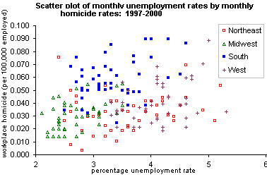
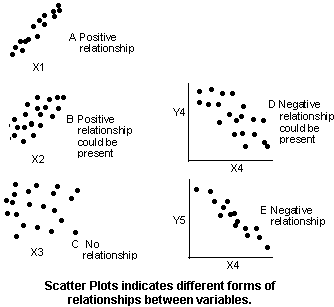
c-Control Chart
c-Chart, belongs to discrete data control charts, it allows you to view the actual number of defects in each subgroup. Unlike continuous data control charts, c-chart can monitor many product quality characteristics simultaneously. For example, you could use a c-chart to monitor many types of defects in a call center process (like hang ups, incorrect information given, disconnections) on a single chart when the subgroup size is constant.
c-Chart is useful in determining if your process is in control by determining whether special causes are present. The presence of special cause variation indicates that factors are influencing the output of your process. Eliminating the influence of these factors will improve the performance of your process and bring your process into control.
You use c-Chart in the Control Phase to verify that your process remains in control after the sources of special cause variation have been removed. The c-chart is used for processes that generate discrete data. The c-chart monitors the number of defects per sample taken from a process. You should record between 5 and 10 readings, and the sample size must be constant. A c-chart can be used in both low- and high- volume environments.
The Control Limits can be calculated as follow:
LCL = Mean - 3 * SQRT(Mean) =0 (because it is < 0)
UCL = Mean + 3 * SQRT(Mean)
[ Click ] example of c Chart.
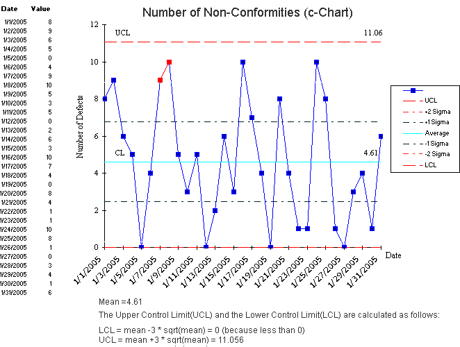
p-Control Chart
A p-chart is an attributes control chart used with data collected in subgroups of varying sizes. Because the subgroup size can vary, it shows a proportion on nonconforming items rather than the actual count. P-charts show how the process changes over time. The process attribute (or characteristic) is always described in a yes/no, pass/fail, go/no go form. p-chart can help you to understand the ratio of nonconforming units to the total number of units in a sample. You use p-chart to determine if the process is stable and predictable, whether special causes are present, as well as to monitor the effects of process improvement. Here you would want to consider how the process is running and compare it to how it ran in the past. Are there fewer nonconforming units?
You will use a p chart in the Control Phase to verify that the process remains in control after the sources of special cause variation have been removed. The p chart is used for processes that generate discrete data.
Collect as many subgroups as possible before calculating control limits. With smaller amounts of data, the p-chart may not represent variability of the entire system. The more subgroups you use in control limit calculations, the more reliable the analysis will be. Typically, 20 to 25 subgroups will be used in control limit calculations.
P-charts, c-charts, u-chart, np-charts, and x-bar/R charts, all have several applications. When you begin improving a system, use them to assess the system’s stability. After the stability has been assessed, determine if you need to stratify the data. You may find entirely different results between shifts, among workers, among different machines, among lots of materials, etc. To see if variability on the p-chart is caused by these factors, collect and enter data in a way that lets you stratify by time, location, symptom, operator, and lots.
| The control limits for p-chart can be determined by this formula: |
|
[ Click ] example of p-Chart.
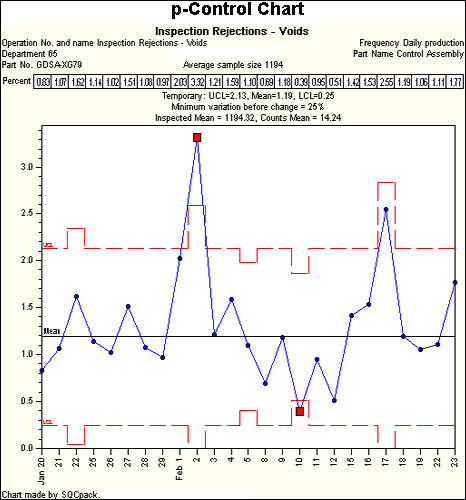
u-Control Chart
u-chart is an attributes control chart used with data collected in subgroups of varying sizes. u-chart differs from the c-chart in that it accounts for the possibility that the number or size of inspection units for which nonconformities are to be counted may vary. Larger samples may be an economic necessity or may be necessary to increase the area of opportunity in order to track very low nonconformity levels. A suitable example to use u-chart would be to monitor the number of nonconformities per lot of raw material received where the lot size varies.
U-charts show how the process, measured by the number of nonconformities per item or group of items, changes over time. Nonconformities are defects or occurrences found in the sampled subgroup such as a scratch, dent, bubble, blemish, missing button, etc. U-charts are used to determine if the process is stable and predictable, as well as to monitor the effects of process improvement.
When do I used u-chart? You would use u-chart when the item is too complex to be ruled as simply conforming or nonconforming. For example, an automobile could have hundreds of possible defects, yet still not be considered defective. As a guideline, Use u-charts when you can answer yes to the questions below:
1. Do you need to assess system stability?
2. Is the data a count of nonconformities per subgroup?
3. Can the counts be converted to proportions?
4. Have the possible nonconformities been identified prior to data collection?
5. Is the time order of subgroups preserved?
The control limits for u-chart are:
|
|
where |
|
is the estimate of long-term process mean established during control-chart setup. |
| The observations |
|
are plotted against these control limits, where Xi is the number of |
| nonconformities for the ith subgroup and ni is the number of inspection units in the ithsubgroup. | ||
[ Click ] example of u-Chart.
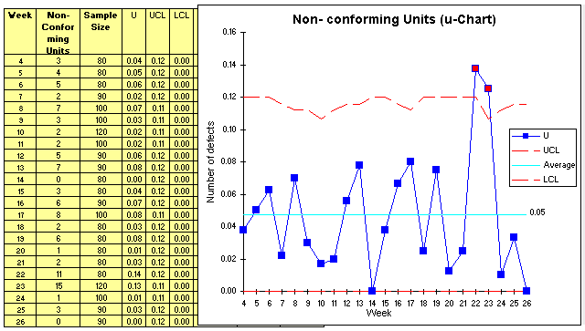
np-Control Chart
The "np" stands for the number of nonforming items, which can be expressed as n (sample size) times p (proportion of nonconforming items). The primary purpose of an np chart is to evaluate process stability when counting the fraction defective. np-chart is very similar to the p-chart except that the statistic being plotted is a number count rather than a sample proportion of items. For example, an np-chart often shows the number of nonconforming items in each sample. np-chart is sensitive to changes in the number of nonconforming items in the measurement process.
Since we are counting failures or successes, the appropriate data for np-charts need to be attribute (discrete) data from the processes. The sample subgroup size for the np-chart must be constant, as comparisons of counts would otherwise be meaningless. np-chart Normally need large sample subgroups – can even be up to total for the period.
np chart is used for processes that generate discrete data. The sample size for the np chart is constant. The np chart is useful when it's easy to count the number of defective items and the sample size is always the same. Examples might include: the number of defective circuit boards per 100 or errors per each sample of 40 invoices.
As a guideline, Use np-charts when you can answer yes to the questions below:
1. Do you need to assess system stability?
2. Is the data a count of nonconformities per subgroup?
3. Can the counts be converted to proportions?
4. Have the possible nonconformities been identified prior to data collection?
5. Is the time order of subgroups preserved?
The control limits for np-chart is determined by this formula:
[ Click ] to see an example of np-Chart.
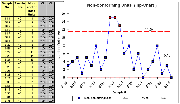
X-bar & Range-Chart
X-bar/R chart is a pair of control charts used with processes that have a subgroup size of two or more. The standard chart for variables data, X-bar and R charts help determine if a process is stable and predictable. The X-bar chart shows how the mean or average changes over time and the R chart shows how the range of the subgroups changes over time. It is also used to monitor the effects of process improvement theories.
Always look at the Range chart first. The control limits on the X-bar chart are derived from the average range, so if the Range chart is out of control, then the control limits on the X-bar chart are meaningless. On the Range chart, look for out-of-control points. If there are any, then the special causes must be eliminated. Brainstorm and conduct Designed Experiments to find those process elements that contribute to sporadic changes in variation.
Also on the range chart, there should be more than five distinct values plotted, and no one value should appear more than 25% of the time. If there are values repeated too often, then you have inadequate resolution of your measurements, which will adversely affect your control limit calculations. In this case, you'll have to look at how you measure the variable, and try to measure it more precisely.
After reviewing the Range chart, interpret the points on the X-bar chart relative to the control limits. Never consider the points on the X-bar chart relative to specifications, since the observations from the process vary much more than the subgroup averages. Look for obviously non-random behavior. If there are any out-of-control points, the special causes of variation must be eliminated.
If the process shows control relative to the statistical limits for a sufficient period of time (long enough to see all potential special causes), then we can analyze its capability relative to requirements. Capability is only meaningful when the process is stable, since we cannot predict the outcome of an unstable process.
When do you use an X-bar/R Chart? There are 2 situations.
You used it when you can rationally collect measurements in subgroups of between 2 and 10 observations. Each subgroup represents a "snapshot" of the process at a given point in time. The charts' x-axes are time-phased and the charts show a history of the process. If the data are not originally entered in the sequence from which it was generated, then you won't be able to detect any trends or process shifts, but instead you may be seeing a random (common cause) variation.
You use X-bar/Sigma-chart instead of Range chart, for subgroup sizes greater than 10, since the range statistic is a poor estimator of process sigma for large subgroups. The subgroup sigma is always a better estimate of subgroup variation than subgroup range.
X-bar Charts are efficient at detecting relatively large shifts in the process average, typically shifts of +-1.5 sigma or larger. The larger the subgroup, the more sensitive the chart will be to shifts, providing a Rational Subgroup can be formed.
Here are the formulas [ Click ] to determine the X-bar/R chart control limits and means.
Also, the formulas [ Click ] for the X-bar/Sigma chart control limits.
[ Click ] to see an example of X-bar/R Chart. Here is another example in spreadsheet [Download]
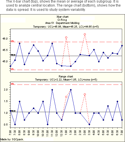
X-bar/S (Sigma) Charts
An X-bar and S (sigma) chart is a special purpose variation of the X-bar and R chart. The pair are a set of control charts for variables data (data that is both quantitative and continuous in measurement, such as a measured dimension or time). The X-bar chart monitors the process location over time, based on the average of a series of observations, called a subgroup. The Sigma chart monitors the variation between observations in the subgroup over time.
Used with processes that have a subgroup size of 11 or more, X-bar and S charts show whether the system is stable and predictable. Instead of using subgroup Range to chart variability, these charts use subgroup standard deviation. Because standard deviation uses each individual reading to calculate variability, it provides a more effective measure of the process spread. Also because the Range statistic is a poor estimator of process sigma for large subgroup sizes greater than 10.
Always look at Sigma chart first. The control limits on the X-bar chart are derived from the average Sigma, so if the Sigma chart is out of control, then the control limits on the X-bar chart are meaningless. After reviewing the Sigma chart, interpret the points on the X-bar chart relative to the control limits. Look for obviously non-random behavior. Never consider the points on the X-bar chart relative to specifications, since the observations from the process vary much more than the subgroup averages. If there are any out-of-control points on the X-bar chart, then the special causes must be eliminated.
[ Click ] see example of an X-bar/Sigma chart.
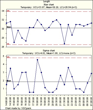
X/mR (Moving Range) Chart
Also called Shewhart's Control Chart, an individual and moving range chart is a pair of control charts for processes with a subgroup size of one. Together they monitor the process average as well as process variation over time. The individual (X) chart displays individual measurements. The moving range (mR) chart shows variability between one data point and the next. Individuals and moving range charts are also used to monitor the effects of process improvement theories.
Always look at mR chart first. The control limits on the Individual-X chart are derived from the average moving range, so if the mR chart is out of control, then the control limits on the Individual-X chart are meaningless. The analysis focus is to separate any exceptional variation present in the data from the routine variation of the process. Quantifying the routine variation is the job of the moving ranges.
Each moving range—absolute difference between adjacent data values—reflects the variation between time periods. The average of the moving ranges is then used to calculate the limits: natural process limits (NPL) on the X chart and upper control limits (UCL) on the mR chart. If a process has only routine variation, the moving ranges, and thus the average of the moving ranges, can be converted to a standard deviation for the process and used to calculate limits on the charts. These control limits are 3 Sigma limits, (recommended by Walter Shewhart) to ensure the economic control of quality of manufactured product.
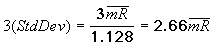
Once you've removed the effect of the out of control points from the mR chart, look at the Individual-X Chart. An important consideration for the Individual-X Chart is the choice of Curve Fit used for determining the control limits. There is a fundamental problem here, in that a distribution should not be fit to the data unless the data is from a controlled process. Unfortunately, you may need to fit a distribution to the data to effectively use the Individual-X chart to determine if the process is in control. Because of this limitation, you may consider using X-bar Chart to first define process control.
Individual X/mR charts are generally used when you can't group measurements into rational subgroups, when it's more convenient to monitor actual observations rather than subgroup averages, or when the process distribution is very skewed or bounded. Each subgroup, consisting of a single observation, represents a "snapshot" of the process at a given point in time. The charts' X-axes are time based, so that the charts show a history of the process. For this reason, you must have data that is time-ordered; that is, entered in the sequence from which it was generated. If this is not the case, then trends or shifts in the process may not be detected, but instead attributed to random (common cause) variation.
If Rational Subgroups can be formed, the X-bar Charts are generally preferred, since the control limits are easily calculated using the Normal distribution. When process distributions are bounded or skewed, or when Rational Subgroups cannot be formed, then it is better to use an Individual-X Chart. This, however, requires that we know the distribution of the process, since this will define the statistical control limits. Individual-X Charts are efficient at detecting relatively large shifts in the process average, typically shifts of +-3 sigma or larger. If X-bar charts can be used, then their larger subgroups will detect smaller shifts.
The UCL and LCL of X/mR control chart can be calculated as:
UCL = Average of observations + 2.66 * Average of Moving Range
LCL = Average of observations – 2.66 * Average of Moving Range
[ Click ] to see an example of X/MR Chart.